Rave Dog Sports
/Website design and membership card design.
Read MoreWebsite design and membership card design.
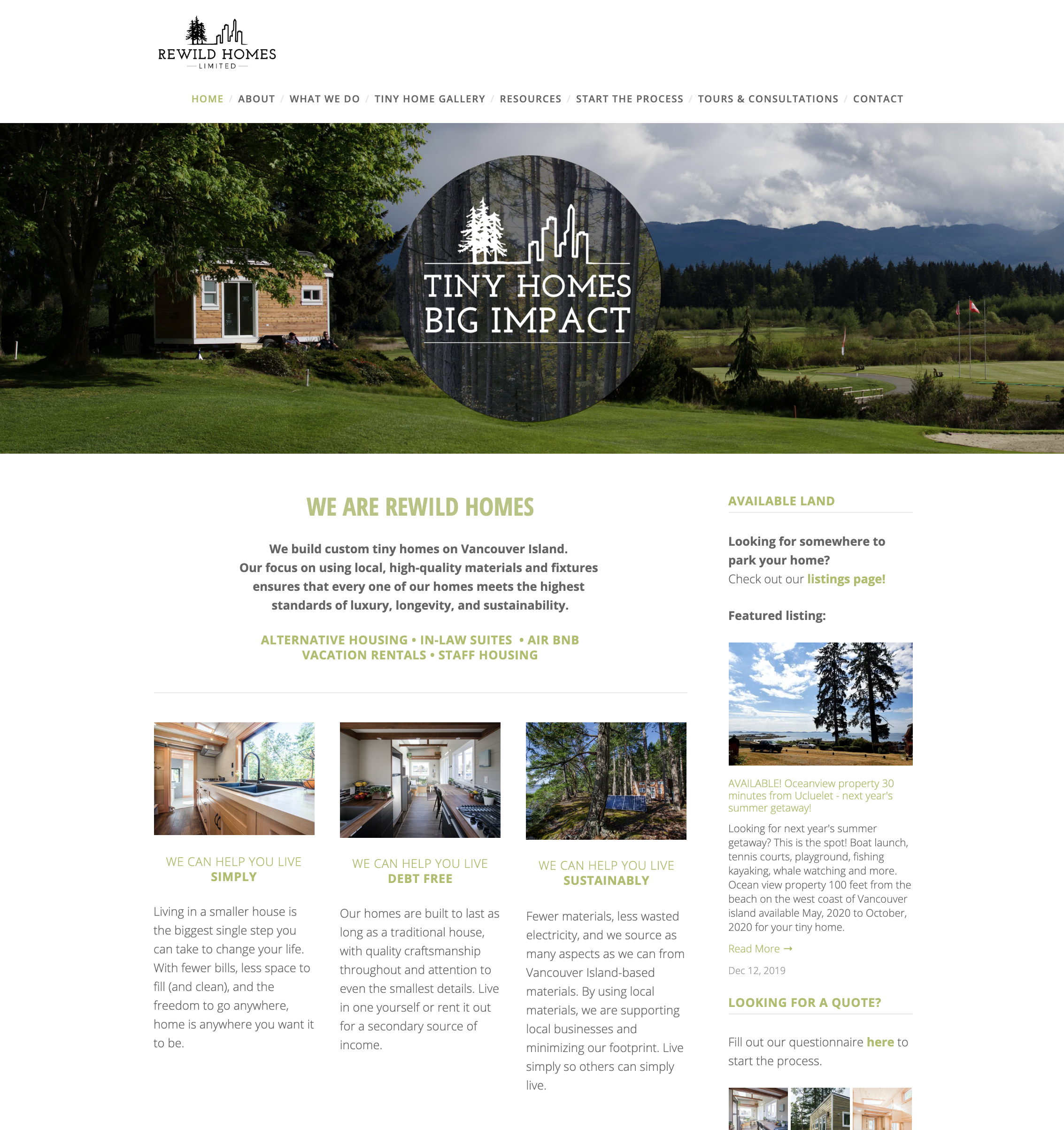
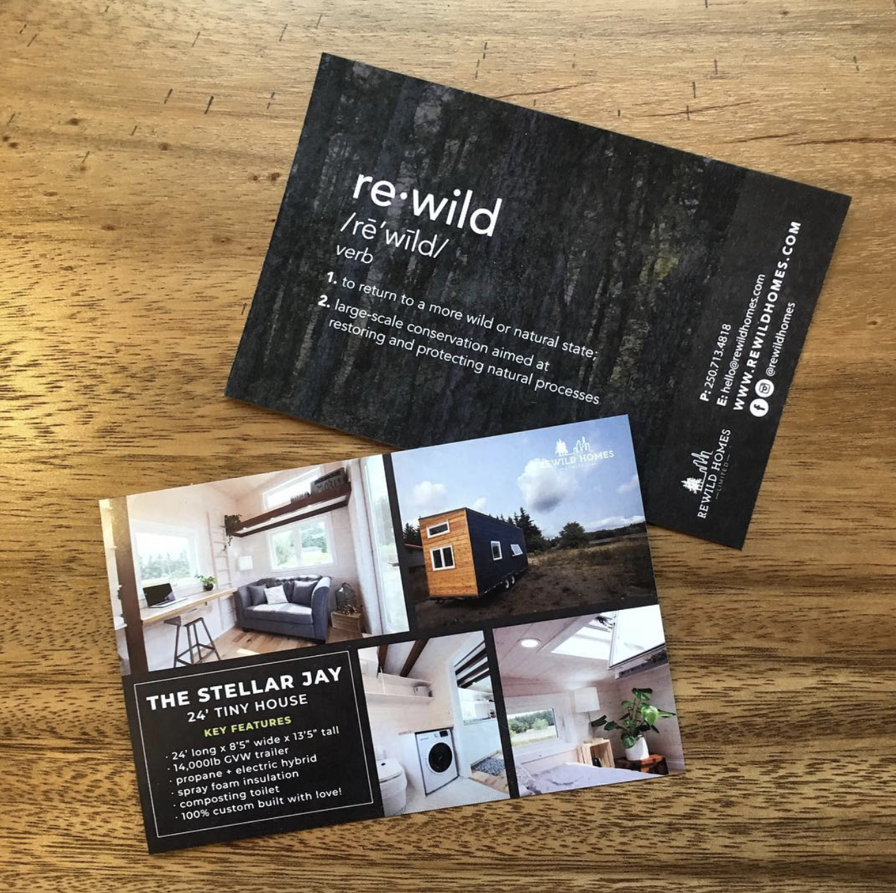
Read MoreRewild Homes Ltd is a custom tiny home manufacturing company that my husband and I started together on Vancouver Island over 6 years ago. I’ve spent the last six years creating and constantly managing an identity for the business, including a logo, collateral, an up-to-date blog and website with over 1500 unique visitors per week, print materials, and online advertising campaigns. Rewild Homes doesn’t just build small homes – they also help people make the shift to a more simplistic home in order to live a bigger life.
We are recognized around the world for our homes. Tiny home design, client communication, administration, branding, photography, social media - you name it, I do it. Along with creating and constantly managing a full identity and branding kit, I also direct and create advertising campaigns, manage all front end aspects of the business appearance, designed and continually maintain an income-drawing blog and website, and manage administrative aspects and perform secretarial duties.
Clean design and friendly, straightforward language are crucial to the brand as a whole. Becoming an active member of the community by attending events with press material in hand, keeping an up-to-date blog and Facebook page, and hosting well-advertised open house days allowed the business to make leaps and bounds in a short amount of time.


I am responsible for all photography and posting on our Instagram account. We are currently at over 25,000 followers and gain dozens - sometimes hundreds - every day.


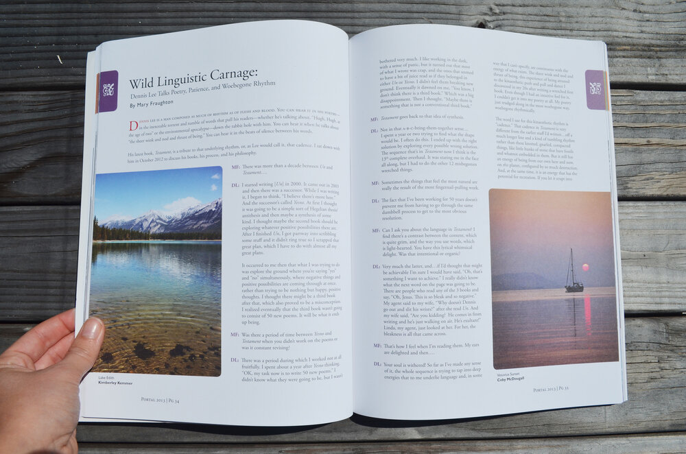
Portal Magazine is an annual, national selling magazine that is based out of Nanaimo, BC. For both the 2013 issue and the 2014 issue, I worked closely with the publisher, editor, art director, and production team to do a complete redesign of the entire magazine. The publisher wanted to keep an island feel yet still appeal to people across Canada, as well as take advantage the four colour printing they were paying for. My main goal for Portal Magazine was to step away from the classic book-style layout that they had been using and introduce a more modern "magazine" feel. I added coloured tabs to differentiate literary types (fiction, non-fiction, poetry, and scripts) for quick reading, and large, full-bleed images with rounded corners to bring a contemporary feel to the magazine. The covers were designed by third year graphic design students at Vancouver Island University.


On the far west coast of Vancouver Island, looking straight out to Japan, is an unexplored wilderness. With only 150 people in town, the beaches are always empty and the trail is always yours. The town of Bamfield is nestled in the heart of the Pacific Rim, surrounded by protected forests and First Nations land. With competitors such as Tofino, Bamfield sits just outside of the radar. As an isolated and tiny town, tourism is important. Fishing, lodging, hiking, cultural tours, and kayak excursions are popular in the area, but the number of people who know Bamfield exist is just too small. There is nothing unifying the possibilities in the area. What Bamfield needs is a distinct brand.
Being one of my favourite places in the world, I took it upon self to develop an identity for the town of Bamfield and its surrounding areas, along with a set of brand standards for guidelines.


Brand guidelines, including: an overview of the town (history, iconic experiences, personality, & tagline); brand elements (logo, minimum size, clear space, dos & don'ts); photography; typography; colour; and collateral.

“On the far west coast of Vancouver Island, looking straight out to Japan is an unexplored wilderness. Accessible only by a harrowing dirt road or by navigating the Pacific Ocean, just getting here provides you with a badge of honour. The beaches are always empty and the trail is always yours. Once you’re here, you’ll know. Life is different out here. See you soon.”


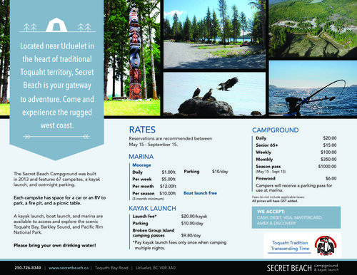
Secret Beach Campground & Kayak Launch is a First Nations operated campground based outside of Ucluelet, on the west coast of Vancouver Island. I was hired to design a branding package for the campground, including a logo, website, brochure, and large-format signage to be installed throughout the campsites.


The City of Nanaimo was looking for a fresh, modern take on the annual cultural awards. The design needed to reflect the bubbling youth culture emerging in the city, as well as stay true to the classic contributors that made it all happen.


The Haida Gwaii Museum (partnered with the Haida Heritage Centre) was voted the best cultural centre in British Columbia in 2012 by the BC Arts Council. Although the museum has been open since the mid-70s, the entire establishment was rebuilt and reborn in 2008. Six full size totem poles were carved for the front of the centre, and the buildings were designed by world-renowned architects to create what looks like a traditional Haida village - save for the huge panes of glass that make up the majority of the walls. After they had completely redone the museum, they also needed to update their advertising presence and in-house graphics. The goal was to create designs that would start to make a sense of identity for the museum. The centre, having more than quadrupled in size, was also lacking in informative signs and wayfinding.
The museum didn’t have anything with their information on it. The large majority of all visitors to the museum are tourists, not from the area or even the country, and often times with English as a second language or not spoken at all. I kept the card clean and simple, and commissioned a local Haida artist for a statement piece that we could use across all their designs. This design was incorporated into all the take-away materials for the center.

The original museum was less than a quarter of the size of the new one and although millions of dollars was spent over the course of ten years developing the new centre, little thought was given to how people would find their way around the new space. We created templates for signage to go throughout the museum, and designed a small logo to signify signs with information. The logo was designed after a Haida copper shield, the largest known of which is the first thing seen when entering the centre.


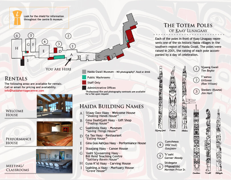
The museum is large and difficult to navigate solo. Guided tours are put on 4 times a day, but most of the visitors through the centre wander through on their own unless timing works perfectly. I design a tri-fold map that would help visitors navigate through the museum, while pointing out attractions, washrooms, and other facilities. The brochure also functioned as an informational pamphlet and as an advertising source for venues such as BC Ferries.

The Navigator is Vancouver Island University’s bi-weekly newspaper. I worked as one of three graphic designers responsible for laying out the paper. Our responsibilities changed with each issue, giving each designer a chance to independently design the cover every third issue. The Navigator is an independent but highly collaborative environment with tight deadlines and strict design standards.


The Nanaimo RCMP put out a call for photography-based posters to spread awareness about the Crimestoppers program. My submissions were one of the chosen series selected to be displayed at the Nanaimo airport and in local high schools.


My name is Jessica Reid. I am a freelance designer and avid adventurist.
HOME / DESIGN / ARTWORK / PHOTOGRAPHY / ABOUT / BLOG / CONTACT
My name is Jessica Whelan and I'm a freelance designer and photographer available for hire. Get in touch.